BD monogram

Design

As Creative Director, I don't get my hands dirty as much as used to, but I like to keep myself current and busy with new and interesting work. Here are some selections from years past.

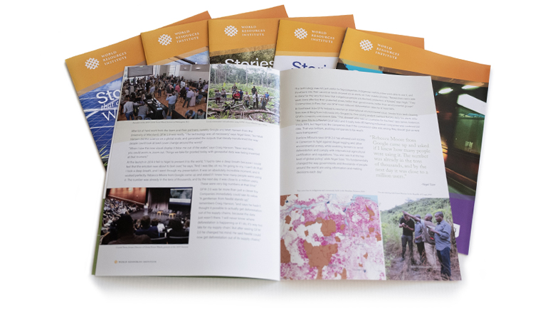
A spread of Stories That Changed the World brochures.

Stories That Changed the World

2025-2026

As part of an overall campaign, we researched and wrote short histories of three of WRI's key initiatives, interviewing key participants, combing through old documents, photos, and footage, and assembling a timeline. From here we developed a narrative, eschewing WRI's normal scientific report-based voice and focusing on the people involved. By spotlighting their experiences and feelings, we put a human voice to what are normally sterile, boring descriptions of big projects.

To accompany each profile video, I set up eight-page brochures with expanded copy, built timelines for each project, and sprinkled each one with historical photos of people and events dug out of dusty boxes and old hard drives.

With grant money I saved from the first round, I had a rare chance to revisit the project for a second year. For this series, I handled all of the interviews, copywriting, and video production, building profiles of two more key WRI initiatives to finish the campaign.

View the Greenhouse Gas Protocol brochure here.
View the EMBARQ brochure here.
View the Global Forest Watch brochure here.
View the New Climate Economy brochure here.
View the Initiative 20X20 brochure here.
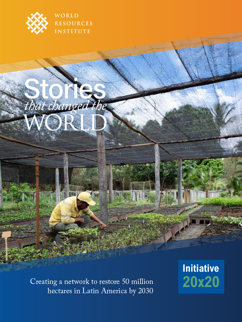
A cover of the Initiative 20x20 brochure.
I used WRI's key brand colors at the top and the key brand color from each initiative, along with their logo and last tagline at the bottom. This basic layout was also used for the display panels.
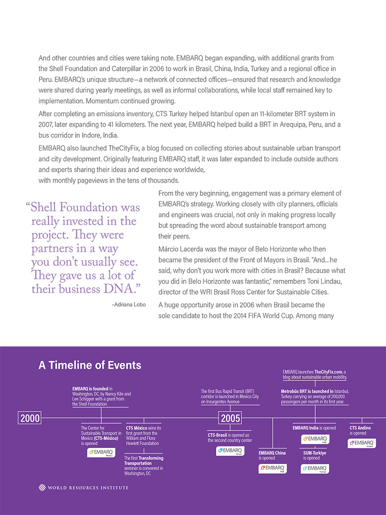
One page from the interior of the EMBARQ brochure, showing one half of the timeline.
Every profile featured a timeline of key events important to that initiative—and WRI as an institution.
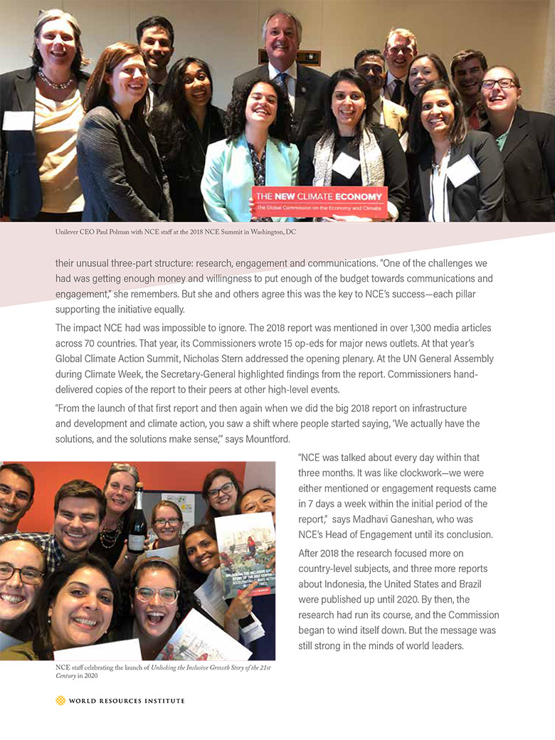
One page from the New Climate Economy brochure, featuring candid photos of the team.
I also placed an emphasis on sourcing and using candid photography of people from each initiative, highlighting the teamwork and camaraderie mentioned in each profile.
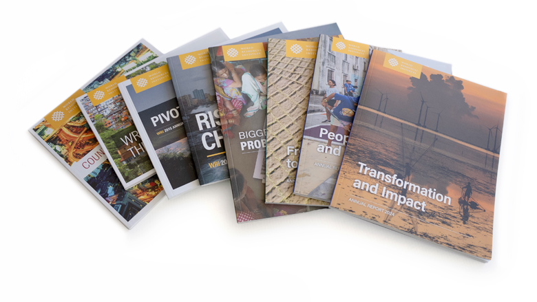
A spread of WRI's Annual Reports from 2014-2024.

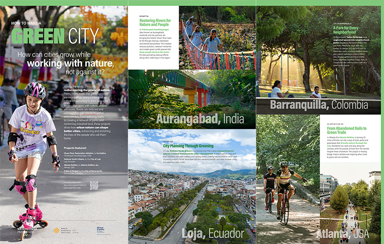
WRI Ross Prize for Cities Panels

2026

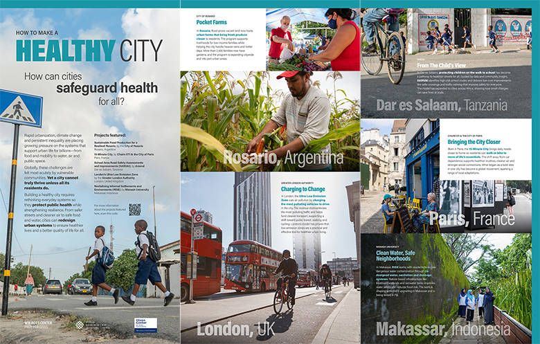
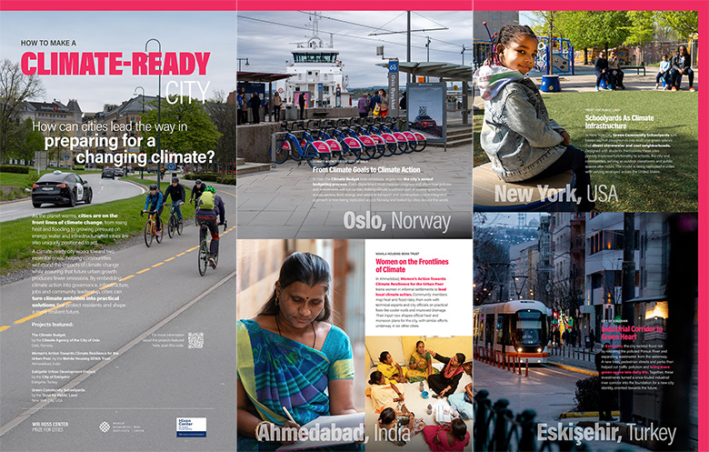
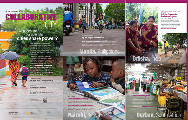
The WRI Ross Center Prize for Cities is a global award given to cities for projects that bring big ideas to critical urban challenges and deliver life-changing impact. Since 2018, the Prize has received more than 1,200 submissions across regions, sectors and issue areas, and awarded $250,000 to each winning city across five cycles.

For the Panel design, we began with a series of themes, using city examples from each Prize cycle to illustrate each one. During the semifinalist phase, crews were commissioned to shoot photography at each location, and I combed the archives to find bold, expressive shots featuring people, with enough room to overlay copy and other information. I built a grid for each panel and used brand colors to connect each triptych. You can see the panel installations here.

View each of the panel spreads here: Spread 1 | Spread 2 | Spread 3 | Spread 4 | Spread 5 | Spread 6

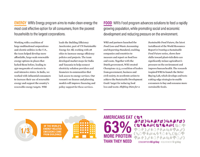
A spread from the 2016 Annual Report, showing text and large data visualizations.
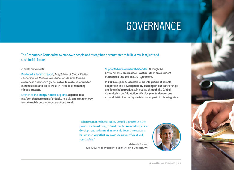
One page from the 2020 WRI Annual Report, showing text and a quote from the Managing Director.
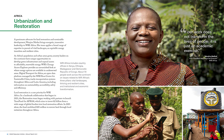
A spread from the 2021 report, featuring a photo and profile of WRI's Regional Director.
A spread of WRI's Annual Reports from 2014-2024.

WRI Annual Reports

2014-26

Due to WRI's 503b nonprofit status, their Annual Reports are a bit different than the traditional format. Aimed primarily at funders and donors, they serve as a recap of the year's big events, highlighting projects that have made an impact, new and important research, new initiatives, and country offices. And because WRI isn't funded by the typical small-donor model, the emphasis is less on emotion and more on impact.

Over the years I've introduced new approaches for making them more engaging—by introducing themes, featuring individual voices, and using data visualization to tell stories.

View the 2020 WRI Annual Report here.
View the 2021 WRI Annual Report here.
View the 2022 WRI Annual Report here.
View the 2024 WRI Annual Report here.

A spread from the 2016 Annual Report, showing text and large data visualizations.
2016 marked the first year WRI published a digital report, and featured large graphic callouts which were animated on the website, as well as a section highlighting newly opened country offices.
One page from the 2020 WRI Annual Report, showing text and a quote from the Managing Director.
2020's pandemic-era report highlighted key initiatives within each of WRI's thematic areas, accompanied by quotes from Board members.
A spread from the 2021 report, featuring a photo and profile of WRI's Regional Director.
The 2021 report featured WRI staff across WRI, juxtaposing their work with that of their country office.
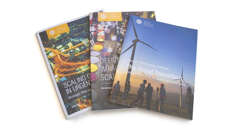
Three Strategic Plans, from 2014, 2018, and 2023.

WRI Strategic Plans

2014, 2018, 2022

As a nonprofit, WRI strategizes, writes, and produces a long-term plan every four years. These begin in the boardroom and wind their way down to the Communications team as the details take shape, requiring months of collaboration and negotiation to refine the details, agree on the contents, and agree on a layout.

These plans are part of a multi-year review of past and current progress, and involve every part of the management team. As such, they are exhaustively reviewed, edited, and developed, which requires constant project management and consultation.

View the 2022 Strategic Plan here.

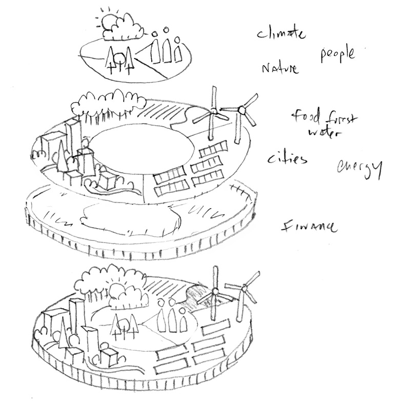
A hand-drawn sketch of a concept visualizing the strategy
For the 2022 Plan, I sketched out a high-level concept to visualize WRI's strategy and reorganization, based on the new narrative tagline of People, Nature and Climate.
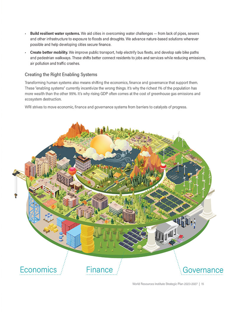
A page from the 2022 Strategic Plan, showing the final illustration and some text.
I engaged an outside vendor to build out the concept, and it became a central part of the short Plan document.
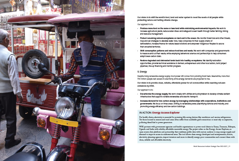
A spread from the 2022 Strategic Plan, showing a full-page photo and accompanying text.
Full-page photography of WRI's work in focus areas broke up the layout from spread to spread.
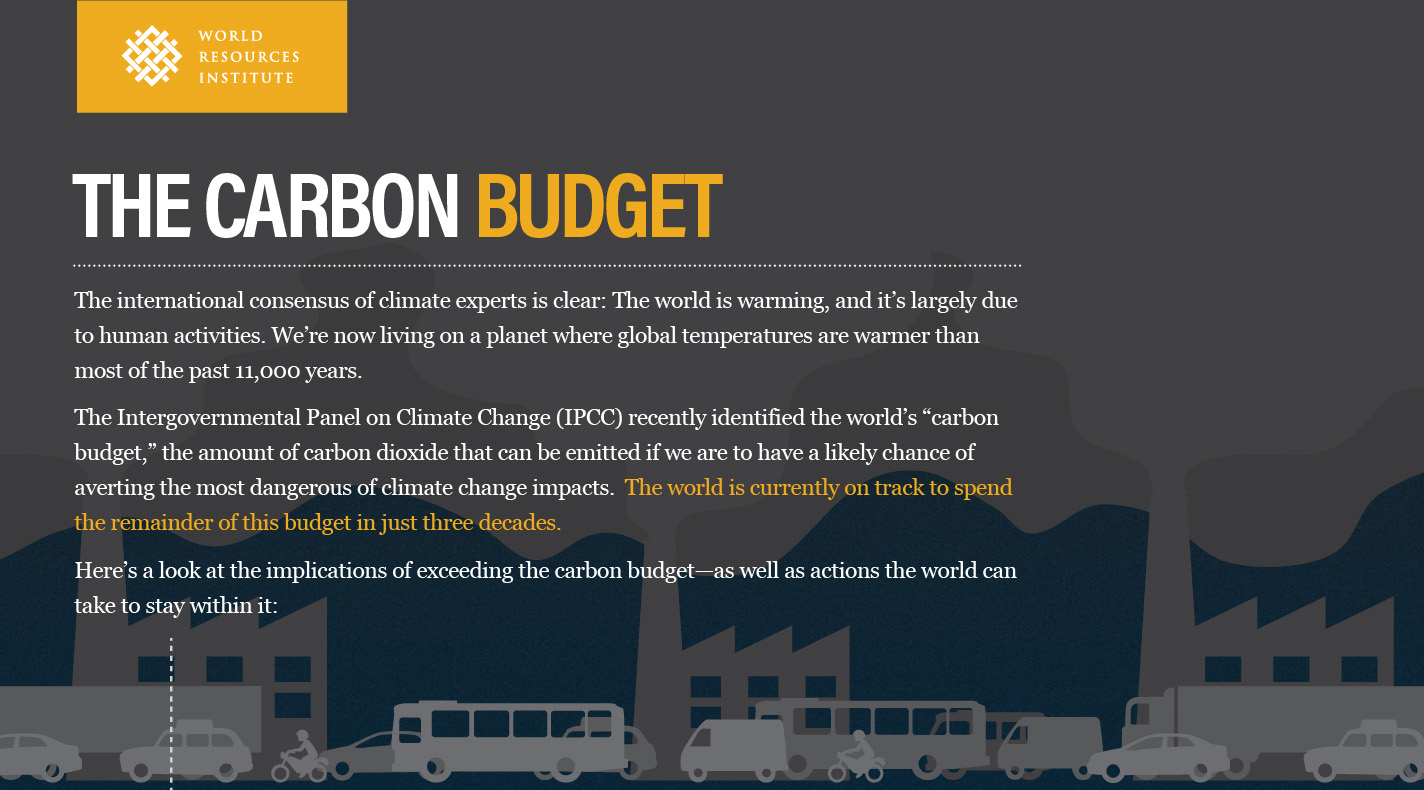
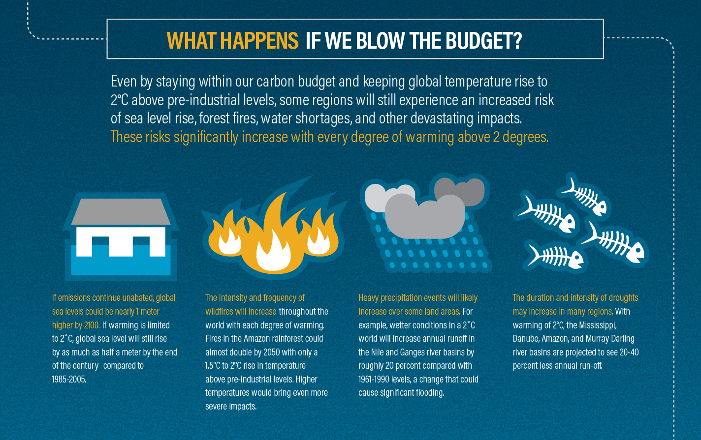
A cutdown of the first section of the IPCC infographic.

IPCC infographic: The Carbon Budget

2013

In the early days of web infographics, the standard format was a long narrow image which could be posted on a webpage, allowing viewers to scroll down in order to see the contents. I took this format and ran with it in the leadup to COP20 in Lima, where the concept of the Carbon Budget and its effect on rising global temperatures was surfacing through newly released IPCC reports.

Part of the problem with explaining climate change is the complexity of the problem, so I used the vertical format to show a sequence of questions explaining the problem, the impact, the risks, and possible solution.

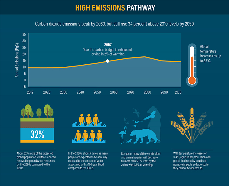
This visual got a lot of social media traction, So I did a follow-up explaining the idea of pathways: four scenarios comparing the temperature and risks to things like groundwater, coral reefs, and biodiversity. These visuals were also designed to be split into bite-size sections for social media and presentations.

View the Carbon Budget infographic here.

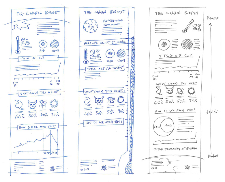
Original hand-drawn sketches of the IPCC graphics.
I started with a basic outline of the story, and with help from the research staff, we fleshed out the details. I used a dotted line to carry through each of the headlines, splitting the content up into sections.
A cutdown of the second section of the infographic.
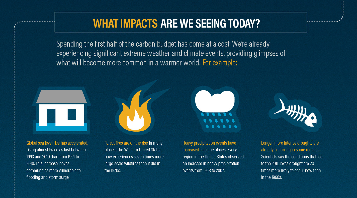
Each section was designed to be roughly the same size so that it could be repurposed into smaller sections.
A cutdown of the fourth section of the infographic.
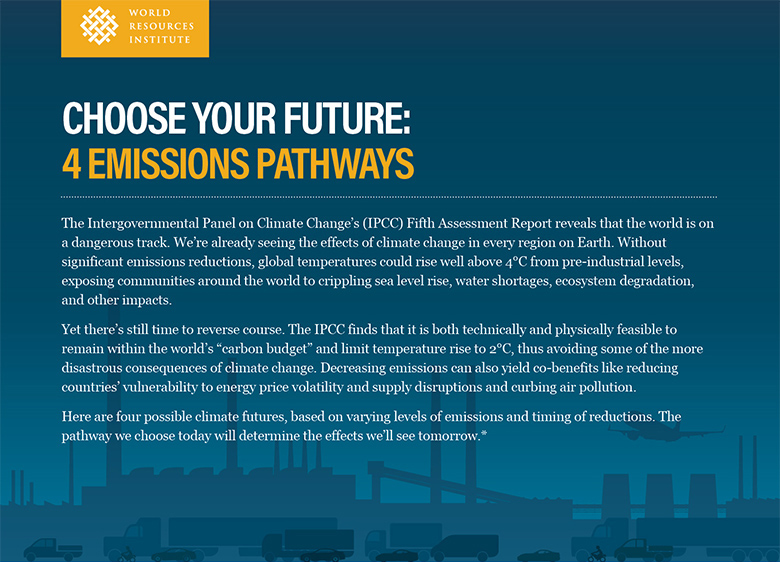
A cutdown of the 4 Emissions Pathways infographic, showing the introduction.

IPCC infographic: 4 Pathways

2014

The 2013 infographic got a lot of social media traction, So I designed a follow-up, using the next IPCC report to explain the idea of pathways: four climate scenarios comparing risk to things like groundwater, coral reefs, and biodiversity depending on how severe the temperature increased. These visuals were also designed to be split into bite-size sections for social media and presentations.

View the 4 Pathways infographic here.

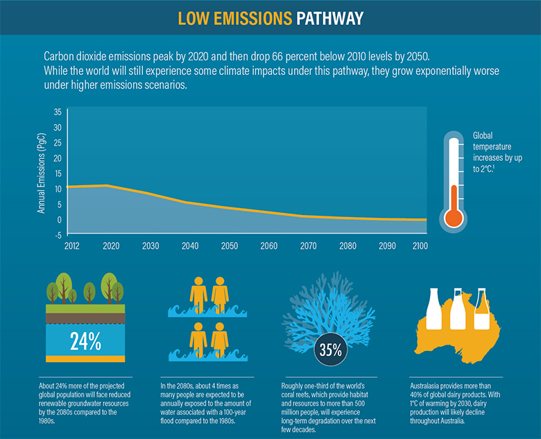
A cutdown of the 4 Emissions Pathways infographic, showing the second section.
The narrative of this infographic was a comparison, so the middle four sections required a grid and elements that could be easily scanned.
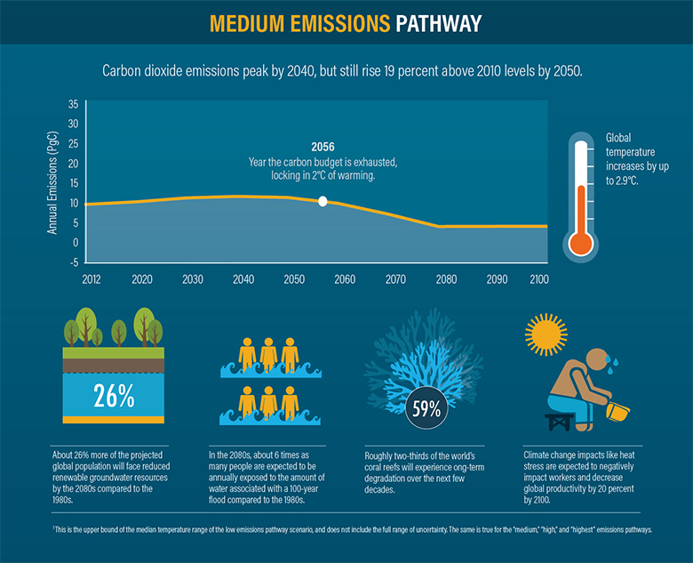
A cutdown of the 4 Emissions Pathways infographic, showing the third section.
This was more difficult than the first infographic, because certain data was unavailable for certain scenarios, making it impossible to compare across all of them.
A cutdown of the 4 Emissions Pathways infographic, showing the fourth section.